“A metaphor for good information design is a map.”
| Edward Tufte
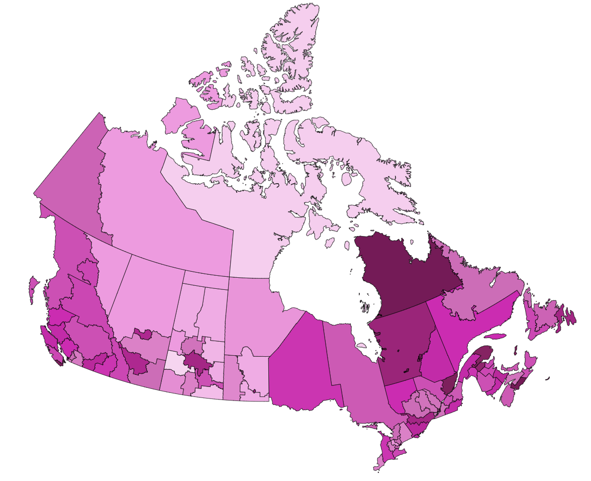
Creating digital interactive maps that are accessible not only ensures compliance with accessibility standards: it’s a skill that provides equitable access to information while empowering everyone in your audience to better understand and interact with complex data visualizations.
Read the full “Creating Accessible Interactive Maps for the Web” Guide” by David Berman and his team
Data specialists and designers who develop maps and infographics may already be familiar with the general techniques of making web pages and documents accessible. This guide provides specific guidance on making maps in web pages accessible: both technical accessibility (in support of WCAG conformance) and functional accessibility (in support of EN 301 549 conformance).
Our guide assumes the reader is familiar with WCAG and its general principles: it focuses mainly on choropleth maps that are embedded within web pages (and the web pages that contain them).
The curated Guide is in Google Docs format, with commenting rights for all, so you can also help us continuously improve it. We welcome your comments!
Deep thanks to our expert clients CIHI (the Canadian Institute for Health Information) and various experts within the Government of Canada for encouraging us, while providing excellent questions, samples, and feedback.