Accessibility Resources for Plain Language Authors and Editors

What every Plain language author and editor should know about eAccessibility

By David Berman (CPWA, ADS) and other contributors at David Berman Communications, September 23, 2023 (revised October 2024)

[Note: this article is referenced within the Resources section of Accessible Standards Canada’s draft standard for Accessible Plain Language: Annex C]

When we use plain language, and we do it well, everyone benefits.

And anyone authoring or editing text as part of the development of any document will benefit from understanding their role in an accessible publishing ecosystem. 

While understanding all aspects of accessible publishing is an asset to anyone involved in the project (including every WCAG success criterion that the organization has committed to), people who author or edit plain language content will especially benefit from being aware of certain WCAG success criteria (as well as the guidance material related to each that unpacks techniques and failures, whether general or targeting specific document types and formats).

Aside from authoring in plain language in general, authors and editors, in order to fully support the additional editorial assignments that may arise in accessible publishing, may need to learn how to extend their skills into these areas:

  • how to author excellent alternative text (typically invisible, though not always so)
  • how to apply and author a variety of long description techniques for complex images (such as infographics), including advanced techniques that differ depending on the file format
  • If the publication includes multimedia:
    • how to author excellent descriptive text transcripts
    • how to deal with special situations that arise when composing and pacing captions
    • how to author the script for audio descriptions (including extended audio descriptions)

WCAG 2.1 AA Success Criteria that impact plain language authoring the most

Of the 50 success criteria required or WCAG 2.1 AA conformance, we’ve identified the ones that impact plain language authoring the most:

(Keep in mind that WCAG 2.1 AA includes all Level A and Level AA success criteria in WCAG 2.1. Also, keep in mind that WCAG 2.1 AA includes all the success criteria within WCAG 2.0 AA.)

WCAG 2.1 AAA Success Criteria that impact plain language authoring the most

For accessible plain language, it is also crucial to consider these WCAG 2.1 AAA success criteria (even though they are likely not required for regulatory compliance):

Furthermore, here are all the WCAG 2.0 AAA considerations that may apply to authoring your document (assuming no multimedia nor forms).

  • Authoring / editing
    • plain language (Grade 9 reading level or less)
    • purpose of all links apparent from the link text alone, wherever appropriate
    • editorial headings designate every individual section of text
    • abbreviations (write around, code, or spell out on first use)
    • provide a pronunciation guide where vital to understanding
    • avoid or define unusual words
  • If you happen to be responsible for the formatting or appearance of a document as well…
    • minimum 1.5 linespacing
    • spacing between paragraphs at least 1.5 times the main linespacing
    • no rows of text more than 80 characters long
    • no justified text
    • no customizable exceptions for Images Of Text
    • higher contrast ratios (7.5:1 for large, 4.5:1 for small)

Editorial issues for accessible documents

I find that document professionals (even those fluent in plain language) are often still puzzled by the extra editorial components that need be authored as part of the process of making a document accessible for everyone.

These extra bits of wording are actually quite easy to write, once you know how to. And they’re extremely important for anyone using your document with assistive technologies, such as screen readers that announce information to those who can’t see or read.

Alternative text (for anything that’s not text)

There are three kinds of situations where one potentially needs to provide alternative text (or hire us to write and/or translate them for you): images, tables, charts, and formulae.

There are also many other rarer cases where objects other than images would need alternative text. However, my team will typically add alternative text to those objects for you as part of our standard process (examples: a decorated drop capital)… or we’ll brainstorm with you on something especially tricky (such as an interactive graph).

Images (aka “figures” as they are often referred to in PDF files)

We need alternative text for all situational images (such as photos) that you don’t want artifacted (artifacting means that the images have no meaning because they are decorative, redundant, or irrelevant). But how to decide if an image is meaningful or not?

Any image that is essential for the text to make sense or for someone to be able to get all the information in the document requires alternative text.

For other images (those that are there only for tone, drama, or intrigue…), you can choose to consider them decorative (so, not deserving of alternative text) on a case-by-case basis. Both approaches are defensible under WCAG 2.0. 

If you do choose to give an image alternative text, then we are seeking wording such as “Photo of meerkat sitting on a bench playing a banjo” … and if the document is not in English, then we need that wording translated into every other language.

Note that you do not have to include the words “image” or “button” or “link” as alternative text, because the assistive technology (such as a screen reader) does this automatically for you. As long as your coding is structured properly, the screen reader knows it is dealing with an image or a button or a link, and so it will actually announce “image” or “button” or “link” (or the equivalent in non-English languages) without any effort on your part. If you were to include such words it will actually be annoying as the screen reader user will hear that word twice… so in the case of a “Next” button, your alternate text should be “Next” rather than “Next button” or “Button Next”.

Do use proper grammar and spelling wherever feasible without compromising the effectiveness of the alternative text. For example, include a period at the end of sentences, just like you would within visible text. Do this  because even sighted users will sometimes be able to see the alternative text (for example, when hovering a mouse pointer over an image in some technologies.

When referencing parts of a document within alternative text, page numbers are not the main way that a non-sighted user navigates a document. They use heading structure rather than page numbers, with the idea that document is broken down by pages is secondary to them. Therefore, although saying “see page 10.” is an acceptable approach, it would be even better to reference a section of the document rather than a page number (e.g., “…in the first four paragraphs of the History Of Cats section”).

The challenge becomes more complex for charts and data tables.

Other resources authors and editors would also benefit from

Go deeper

Contact us to learn more about plain language accessibility for you and your team, consider bringing our tailored “Writing for the Web with Accessibility in Mind”, “Accessible Multimedia”, and “Introduction to eAccessibility” courses, learning guides, or coaching to you!

Transcript of “Sheldon Kennedy talks about David Berman Communications accessibility partnership”

This is a transcript of the video Sheldon Kennedy talks about David Berman Communications accessibility partnership.


(A man in a black suit and glasses faces the camera, and continues to do so throughout the video.)

Hi, I’m Sheldon Kennedy, co-founder of Respect Group. Respect Group is founded on principles of inclusivity. It is one of our key fundamental values in terms of what we believe in at Respect Group and the programs we offer. Having Respect Group accredited at this level means we are living up to our highest standard. We now know that every user, regardless of any disability they may be facing, will be able to access our program equally, and to us that is critical.

David Berman, communications, was a great partner for us to work with. We had a terrific experience. Their team was highly professional and detail-orientated and worked closely with us through every step of the process. They were quick to respond to questions and offered helpful solutions for areas that required improvements. They were very detailed, comprehensive in their audit which ultimately resulted in a great outcome.

We are proud to have achieved WCAG 2.1 conformance, and thank you to the Berman Team for helping us become certified accessible. Certified accessible, awesome.

[END OF TRANSCRIPT]

Accessible online meetings

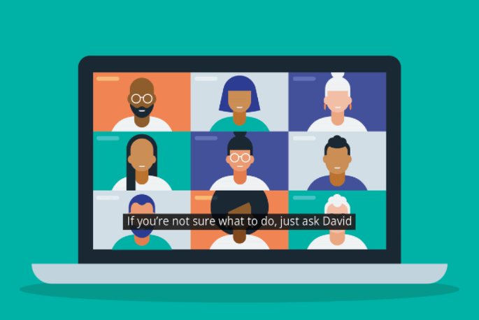
Illustration of a laptop showing online video meeting of 9 participants, including sample captions.

“If you’re not sure what to do, just ask.”

By David Berman, with Maham Farooq and other contributors at David Berman Communications

[Thank you also to the Canadian Association of the Deaf, and CAST for their help! Some content used with permission from Brian Kon and from the Disabilities Issues Office, Government of Manitoba.]

If you don’t have a lot of experience hanging with people with disabilities, you may be afraid to do or say the wrong thing, especially when you’re in a live gathering with people you’ve perhaps just met.

Interacting with everyone is actually pretty easy: people living with disabilities are people first. They need the same things that every person needs. The easiest way to show respect is to focus on the person and not the disability.

You can think of distance participation as a basket of temporary disabilities: not being able to see or be seen, hear or be heard, or otherwise interact in ways that are easy to do in persondys and when fully abled.

So let’s get you comfortable, and poise you to be able to help everyone get the most out of every meeting…

Welcoming everyone

Treat everyone with respect. If you are unsure what to do or how to assist someone, ask them. A person with a disability in an unfamiliar environment may be much more vulnerable or awkward than in familiar surroundings.

It’s very cool that you’d like to help: however, do ask first … what you think might be helping may be the opposite.

Just because someone is blind does not mean that they are Deaf. And just because they are Deaf doesn’t mean they are blind. If you’re not sure what to do, just ask: treat others the way you would want to be treated and we’ll all be okay!

So first, get comfortable with what words are best…

Vocabulary

  • In general, refrain from using negative terminology to refer to differing abilities. For example, a person is not confined to their wheelchair, they use a wheelchair. 
  • Avoid terms such as disabled or handicapped; however, the word “disability” is acceptable and “living with a disability” can be even nicer. 
  • Use people-first terminology (except with people from Deaf or Autistic cultures). For example:
    • Dr. Durocher is a person living with a disability.” instead of “Dr. Durocher is disabled.”
    • Joe Singh uses a wheelchair.” instead of “Joe Singh is confined to her wheelchair.”
    • They are a person with quadriplegia.” instead of  “They are a quadriplegic.
    • …but “Jak Johnson is Deaf” instead of “Jak Johnson has a hearing disability” and “Ahmed is hard of hearing” instead of “Ahmed is hearing-impaired.” (because the Deaf community doesn’t consider not hearing to be a disability nor an impairment).
  • Use respectful terms when referencing persons living with disabilities:
    • “people” or “all of us” instead of “those people”, “you people”, “them”
    • “person living with a disability” instead of “the disabled”, “the handicapped”, “special”, “deformed”
    • “person living with mental illness” instead of “person with mental health issues” or “mentally ill”, “insane”, “crazy”
    • “person with a mobility disability” or “person with a _____ injury” instead of “physically challenged”, “crippled”, “lame”
    • “person who uses a wheelchair” instead of “person confined to a wheelchair”
    • “person who has diabetes”, “person living with arthritis” instead of “diabetic person” or “person suffering from arthritis”
    • “accessible parking/washrooms” instead of “handicapped/disabled parking/washrooms”
    • “person without a disability” or “typical people” instead of “normal”
    • …and, please, let’s all just stop using the words “dumb” and “dummy” as a synonym for stupidity!
  • Warning: You may, understandably, be tempted to use terms based on the names of organizations or documents with historical names. Don’t. For example, don’t refer to people of atypical abilities as “disabled” because you see the word “Disabilities” in the Americans With Disabilities Act (1990). This would be like referring to indigenous people as “Indians” inspired by the Indian Act (1876) or talking about “colored people” based on the spelled-out version of the NAACP (National Association for the Advancement of Colored People).

Blind and low vision

  • Instead of “blind person” or “the Blind”, say “person with visual challenges” or “people who are blind”.
  • Most of these tips are appropriate for both people with low vision as well as those who are blind. 
  • Many people who are “legally blind” have some sight: A person can have significant vision loss to the point they are considered legally blind, but that does not mean they cannot see. For example, some conditions create black areas in the middle of the person’s vision allowing them only to see in the periphery of their field of view. Other conditions create dark outer edges as if they are looking through a tunnel while maintaining 20/20 vision in the middle. Some people view the world through a haze; others can only see light versus dark. It is important to note that a person who uses a white cane, or has a service animal, may be able to see well enough to move about their environment. They may also be able to see facial expressions yet can’t read text.
    • It can be difficult to differentiate between a person being blind and a person living with low vision: Your best clue to how much vision the person has is likely by observing how they move within the environment.
    • When identifying with the disability community, the choice of identifying as a person who is blind versus as a person with low vision is a personal one.
  • Phrases like “see you later” and “read this” when interacting with someone who can’t see are fine and natural.
  • The blind community is fine with you calling blindness a “disability”
  • The proper noun “braille” is not capitalized (even though it’s named after Mr. Braille!). Braille is an alphabet (or “code”), not a language.

Deaf and Hard of Hearing

  • The Deaf community:
    • uses “Deaf” as a capitalized word, so you should too
    • distinguishes between “culturally Deaf” (for someone born deaf and typically exposed to Deaf culture) versus someone who, due to profound hearing loss later in life to the extent that they are medically considered deaf, is native to a hearing world.
    • does not classify being Deaf as a disability (except in certain regulatory situations) … and thus prefers “identity-first” language rather than “person-first” language
    • has sign languages as their native languages
      • ASL (American Sign Language is the main sign language used in the USA and English Canada), LSQ (Langue des signes québécoise) in French Canada.
      • Other popular sign languages in North America include LSM (Lengua de señas Mexicana), Plains Sign Language (PISL), IUR (Inuit Sign Language – Inuktitut: Uukturausingit ᐆᒃᑐᕋᐅᓯᖏᑦ or Atgangmuurngniq ᐊᑦᒐᖕᒨᕐᖕᓂᖅ) in northern Canada, and a variety of other indigenous and regional sign languages.
      • Sign languages are not a format nor a dialect of spoken languages: they are distinct languages, each with its own grammar and syntax.
      • Just like written languages, sign languages have local accents and colloquialisms based on where you live: the Canadian dialect of ASL is as different from American ASL as Parisian French is to Quebec French or Castilian Spanish is to Colombian Spanish.
  • People who grew up hearing and then lost hearing later in life (“Hard of Hearing”, “Deafened”) typically prefer captioning and are more than likely not fluent in a sign language
  • Acronyms you may come across:
    • “DHH”: Deaf people and people who are Hard of Hearing
    • “HoH”: people who are Hard of Hearing
    • “DDBHH”: Deaf people, Deaf-Blind people, and people who are Hard of Hearing

Neurodisabilities and intellectual differences

  • The Autistic community includes many who prefer “identity-first” language rather than “person-first” language. That means you’d say “Autistic” rather than a person “living with autism”.
  • Use respectful terms when referencing what people can do: say “high support needs” and “low support needs” rather than “high functioning” and “low functioning”. Even better, refer more specifically to their cognitive or verbal abilities.
  • Use “on the spectrum” or “autism spectrum condition” rather than “autism spectrum disorder” or “disease” or “illness”.
  • Use “intellectual difference” or “intellectual disability or “neurological developmental disability” rather than “mentally handicapped”, “learning disabled”, “developmentally delayed”, “mentally retarded”, or “mentally challenged”
  • When comparing to typical people, use “neurotypical” and “typical adults” and “typical developing children” rather than “normal” or normally developing” or “healthy”.

Introductions

  • Give people who are differently-abled the option to self-identify during introductions and/or in their “screen name”.
  • Be patient: Remember to give everyone the time and space they may need in order to feel comfortable, possibly needing more time than you are accustomed to for settling in and interacting.

“People with disabilities are individuals with families, jobs, hobbies, likes and dislikes, and problems and joys. While the disability is an integral part of who they are, it alone does not define them. Don’t make them into disability heroes or victims. Treat them as individuals.” – United Spinal Association

Interacting with everyone

In general, if you’re not sure what to do, just ask. And if you’re not sure exactly what to say, try this: “Would you like any help?” …beyond that, how to interact best depends on the individual.

Person accompanied by an attendant or interpreter

  • When meeting or greeting any person with atypical abilities, consider our general advice above about welcoming everyone.
  • Attendants or interpreters may be paid professionals, friends, or family members. Interpreters may be interpreting between two spoken languages, between a spoken language and a sign language, or even between two sign languages.
  • If an attendant or interpreter accompanies the participant, you could ask the participant if their attendant will be present throughout the event. When the attendant or interpreter is present, direct any exchange to the participant, not their attendant. While it may seem strange to you, an interpreter is not a “participant” per se when you are interacting with a person with a disability.
  • If an interpreter is introduced to you or to the group at all it will typically only be to state their role. While in the role of interpreter, they should not be involved in the discussion other than to faithfully share messages amongst participants. In their role as an interpreter, they will typically share everything you express: that’s their job.
  • Participants needing to see sign language interpretation will want to “Pin” the interpreter so that they can see their full video, larger, and in the best place for them on their screen.
    • Participants needing spoken language interpretation will either rely on captions or a separate voice channel using technology outside of what is possible on the meeting platform.

Person with a motor, mobility, or dexterity challenge

  • When meeting or greeting any person with atypical abilities, consider our general advice above about welcoming everyone.
  • Be patient: If a person can’t use a mouse, they are likely to navigate the online space in a way that is slower or more awkward than for participants using a pointing device. For example, they may be using a foot pedal to step through every selection in the interface before getting to select the one they need. If there is an anticipated wait before an event begins or before moving to a breakout room, you can offer the person help to find their place.
  • Be ready to be helpful: Proudly know the shortcut keys for anyone who is struggling to get stuff done at game speed.

Person who is blind or has low vision

  • When meeting or greeting, consider our general advice above about welcoming everyone as well as our vocabulary for blind and low vision.
  • Bias towards being the first person to speak in an interaction with someone who is blind or has low vision, as you will likely have more context than they will.
  • Blind or low vision users will typically use a combination of assistive technologies to help them interact without relying on vision:
    • Screen readers can announce everything that is relevant on the screen as the user navigates to each element (typically tabbing through each element, as using a pointing device is not feasible for someone who can’t see where the pointing device is located). The screen reader also may announce what they type (typically wired to their headset for both privacy and to avoid distracting others). Because the user is also potentially trying to listen to you express yourself, don’t be surprised that there may be long pauses while the participant switches between listening to you; listens to what’s in the chat, listens to the interface; listens to what they are composing in the chat; etc. Don’t be surprised to occasionally hear the screen reader chatter in the background: it may be at a speed so fast you won’t be able to understand it!
    • Dynamic braille displays present information in braille, and are often used by those fluent in braille in concert with a screen reader (this is especially helpful when someone has the screen reader announcing what they type)
    • Magnifiers enlarge what’s on the display and may limit what can be seen at once or cause interface objects to overlap.
  • Be aware that the experience of someone who has never seen is substantially different from that of someone who had typical vision at one point but doesn’t have it now, or may still have some sight. For example, someone who recalls what things look like may rely on those memories or use visual concepts to organize information very differently than someone who has always relied upon audio or tactile approaches. They could, for example, be able to sign a physical document, with limited assistance or understand a context that is instructing others based on color. If you don’t know, assume they have never seen: if you feel comfortable, the first time it would help you help them to know, you could privately ask them for permission to ask (including telling them why you are asking).
  • If you are in a physical space and have the opportunity to assist the person when moving to a new location, you would first ask if you could assist. If they do want help, you would position yourself on the side of the individual opposite to their white cane or service animal. You would then extend your bent arm back so that your elbow touches their upper arm. They would grab onto your upper arm (don’t grab them!) and then hold on to you as they follow slightly behind as you walk.  … and the same applies online: offer to help them get where they want to be.
  • Guide dogs (like all service animals and other accommodation tools and assists) are personal: don’t interact or touch them unless invited to. Don’t take it personally if you’re told not to!
  • If you were in a physical space, and your path of travel changes in elevation (such as stairs) or moves through narrow spaces (doors, narrowed hallways), you would let them know what is happening. When going through doorways, you would maintain your position slightly in front and tell them you are about to go through the door; then extend your arm back so the two of you take up less width to fit through the door. The equivalent in an online meeting, if the platform has such a feature.
  • When leading a person to a place to sit, you would identify where the chair is in relation to where they are now, and describe a brief layout of the entire space
  • Whether in a physical or a virtual space, you want to ensure that a person who cannot see is aware of who else is present. Also, tell them about anything else that is unexpected: for example, in a physical space, you’d warn a non-visual person that you’ve put a cup of coffee in front of them (perhaps based on clock directions): in the virtual space, you may wish to mention that the presenter was wearing a badger costume but now has wandered off camera.
  • If you are in an audience for a live presentation that may include people without typical vision, the presenters should be either live-describing anything relevant that can only be seen (for example, a picture on a slide being shown) or providing an audio description of some sort. This way those who cannot see are still aware of all relevant content. Similarly, if you are expressing yourself in a meeting and referencing anything visual (for example, you are holding up a puppet of a badger), you need to also gain the habit of live-describing what is relevant (for example, “It’s a puppet of a badger… not an actual badger!”) … unless there is a formal audio description service in the meeting, in which case you can also rely on that audio track).
  • A great habit is to self-identify the first time you begin to express yourself and every time at least two other people have spoken since you last spoke (e.g., “David Berman speaking”). This helps everyone, including interpreters and transcribers, know who’s speaking, as well as gives people a moment to remember who you are. It may seem awkward to you at first… you’ll get used to it, and everyone will appreciate it immediately and learn from your example.
  • When directing a question at someone, state their name: don’t assume that visual or conversational cues will be obvious to them (as well as to others who may think the question is directed at them!).
  • The environment can have a big impact on a person with low vision’s ability to use what residual vision they have. For example, if you are visible, be in a well-lit space that is not so bright that it would be hard on someone who has light sensitivity (avoid having an outdoor window behind you).
  • Just like in a physical space, if someone enters or leaves the space, we want everyone to know.

Person with a color deficit

  • When meeting or greeting any person with atypical abilities, consider our general advice above about welcoming everyone.
  • Whether someone has a complete color deficit (which is quite rare) or doesn’t see all color typically, be careful not to provide instructions or presentations that rely upon color alone to succeed. For example, say “Meet me in Room 1 (the blue one), rather than “Meet me in the blue room”.

Person who is Deaf

  • When meeting or greeting, consider our general advice above about welcoming everyone as well as our vocabulary for Deaf and Hard of Hearing (especially concerning “Deaf” and “disability”).
  • A Deaf person may not have the ability to speak in a typical way. Therefore, they may use a different form of communication. In a physical space, for example, they could present a pre-printed card self-identifying that they are Deaf. In the online space, they may add “(Deaf)” to their meeting name (just like someone may self-identify their pronouns as “(he/his)”).
  • A Deaf person may have some hearing. Often they are able to use devices such as hearing aids (which amplify sounds) or a device known as a cochlear implant (a device that simulates sound by sending electrical impulses to the auditory nerve which the person interprets as sound or words).
  • If a Deaf person also knows, for example, English (often referred to as being “bilingual” in the USA), take into account that it is their second language (just like anyone in an “ESL”-like situation) and therefore may not be as strong as that of other participants when expressing themselves in another language. They may struggle to fully understand your written messages, and their own written messages may not be well-expressed or in the expected word order (due to the grammatical differences between their native sign language and the spoken language).
  • If you don’t know how to sign (or don’t have a signed language in common with the person), consider learning sign language (even some basics): it’s fun and will unlock your creativity in ways you don’t expect!
  • If a sign language interpreter is present, always speak directly to the Deaf person (ignore the interpreter… it’s their preference too: you won’t offend them!). The interpreter will announce the person’s response if they cannot speak.
  • If there is no sign language interpreter nor captions (and your signing ability is not sufficient for the topic), use written forms (live chat, hold up a written message in view (using pen, paper, tablet,…) or AI live transcription if it will be of sufficient quality.
  • Take full advantage of how virtual spaces help Deaf people (compared to a virtual space where everyone is, for example, around a table) because they can line up everyone visually side-by-side rather than having to search the room guessing who may start speaking or signing next (and often missing content because of it).
  • Depending upon their fluency in the language of the captions, quality of the captions, and personal preferences, Deaf people may take advantage of captions … especially if sign language interpretation is not available.
  • Be patient, because interpretation or captions (especially quality captions scribed by a human interpreter) are often delayed five seconds or more.
  • A Deaf person may be augmenting limited hearing by watching your lips or facial expressions. Therefore, definitely be on camera in a virtual meeting. Also, avoid hiding your face (for example, behind a coffee cup) or look away while speaking, as portions of the conversation may be lost. Similarly, if the other person is looking away, for example, while needing to view a document, wait until they look at you again before speaking.
  • To get the attention of a person who cannot hear in a physical space, it would be appropriate to wave within their field of vision, gently grab their upper arm, or knock on the table. In a virtual meeting, you do the same. The “Raise hand” feature in the meeting’s software is not a good substitute because it is not directed at an individual. Deaf people will often use this same technique to get the attention of anyone in the meeting, including signaling to the interpreter that they wish to contribute.
  • Make sure you are in a well-lit space so that your lips and facial expressions are easy to see: this will help these assistive characteristics be easily available to all who wish to follow the conversation. Avoid having an outdoor window or a source of bright light behind you. (PS All sighted people lipread: you may not even notice that you do it!)
  • If you need an unobscured view of the sign language interpreter, consider arranging your view so that, for example, notification windows or dialogs won’t get in your way.
  • DeafBlind people will typically have a specialist interpreter, fluent in tactile sign language, as well as specialized assistive technology.

Person who is hard of hearing or deafened (or processes spoken language atypically)

  • When meeting or greeting, consider our general advice above about welcoming everyone and our vocabulary for Deaf and Hard of Hearing.
  • A person who is hard of hearing or deafened will often have some residual hearing. Often they are able to use devices such as hearing aids (which amplify sounds).
  • A person who is hard of hearing or deafened will very possibly be able to speak.
  • It may become obvious that a person is not paying attention to instructions, or is having difficulty hearing the conversation. If so, make eye contact with the person when presenting. As well, if they are not looking at you (for example, they may be recording information), wait until you have their attention.
  • Eliminate background noise at your end: turn off background music or televisions, close your door, turn on noise suppression, and ask others in your area to lower their noise level. And mute your mic when not speaking.
  • Try adjusting the position or volume of your microphone … consider a better microphone: avoid using the built-in one on a laptop or smartphone.
  • It may be necessary to speak with more volume, but do not shout (shouting distorts the sound, making you more difficult to understand).
  • Speak in a natural voice: do not exaggerate the words when you speak.
  • If it is clear the person is having difficulty hearing your message, try using different words to say the same thing.
  • Keep in mind that many of these points are also relevant in a situation where you are accommodating someone whose native spoken language is different from yours.
  • Take full advantage of how virtual spaces help people who are hard of hearing (compared to a virtual space where everyone is, for example, around a table) because they can line up everyone visually side-by-side rather than having to search the room guessing who may start speaking or signing next (and often missing content because of it).
  • Unless the captions are poor, people who are hard of hearing will rely heavily upon them: be patient, because the captions, especially quality captions written by a human interpreter, are often delayed five seconds or more.
  • They may be augmenting limited hearing by watching your lips or facial expressions. Therefore, definitely be on camera in a virtual meeting. Also, try not to hide your face (for example, behind a coffee cup) or look away while speaking, as portions of the conversation may be lost. Similarly, if the other person is looking away, for example, while needing to view a document, wait until they look at you again before speaking.
  • Make sure you are in a well-lit space so that your lips and facial expressions are easy to see: this will help these assistive characteristics be easily available to all who wish to follow the conversation. Avoid having an outdoor window or a source of bright light behind you. (PS Everyone who is visual lipreads: you may not even notice that you do it!)

Person who is unable to speak or has challenged speech (or challenged signing)

  • When meeting or greeting, consider our general advice above about welcoming everyone.
  • Challenged speech can be due to a variety of situations, including aphasia, delayed speech, no speech capability, articulation challenges, or a lack of knowledge in a particular language.
  • Don’t assume that just because someone has challenged speech that they don’t hear and comprehend typically.
  • If a person stutters or needs more time, do not finish their thoughts. Wait patiently for them to finish before responding.
  • Do not assume you have understood the meaning of what they are saying before they are finished.
  • If you have difficulty understanding what a person is expressing, ask them to repeat, rather than trying to guess what was said. If, after a second try, the message is still unclear, ask them to try telling you again using different terms.
  • Captioning technology (and human captioners) can be quite challenged by atypical speech.
  • Some people with challenged speech or no speech will use sign language to express themselves, and thus may benefit from the presence of a sign language interpreter. Others may rely on the Chat feature (or similar technologies).

Person using a speech synthesizer or other expression assists

  • When meeting or greeting, consider our general advice above about welcoming everyone.
  • A person using a speech synthesizer (e.g. some Deaf people or people with challenged speech or no vocal ability) will type their message into a device that announces the message for them. In some cases, they will have set the machine to spell out each letter back to them audibly as they compose. Once they have completed their full thought, they will cause the machine to announce it, in a voice that may sound robotic or mechanical. While the person is entering the message don’t talk or sign to them: let them complete their thought.
  • Speech synthesizers include tablets, computers, smartphones, and specialty portable electronic devices.
  • Be aware that the synthesized voice may not always match the voice you are familiar with or expect for that person.
  • Some people use portable communication boards (digital or physical) that simply include letters of the alphabet and other symbols to point at. As they point to a symbol, state the letter or idea they are pointing to – this helps them know that you are following their conversation. When you get to the end of the word they will pause, this is your cue to state the word: they will confirm and then move on. This form of communication uses the least amount of words to get the message across.

Person with an intellectual, neurological developmental, or learning difference

There are a wide range of conditions that may present differently for a person with an intellectual or neurologic difference. Examples include Tourette’s syndrome (or other conditions on the autism spectrum), dyslexia, ADHD, dysgraphia, mysophobia, or memory or distraction challenges. These affect how the person’s brain interprets information and how they respond to the information or their environment. It is not a reflection of their intellect. These may be difficult to determine unless the person identifies they have a disability or difference.

  • When meeting or greeting, consider our general advice above about welcoming everyone and about neurodisabilities and intellectual differences.
  • In a physical space, the room could be set up to minimize distractions from the conversation by positioning people so they are not looking out a window or open door, and reducing background music or voices. Online we can do the same by attending to our camera backgrounds and any background audio.
  • Reading challenges: People with an attention deficit or a reading disorder may read materials multiple times before they can absorb the content. A person who has dyslexia may struggle to process written language (which can impact their fluency, comprehension, and decoding). Therefore, they may ask to take the material home to read. If there are lengthy documents that need to be read, provide a few private minutes and allow the person to concentrate on the material without being distracted: reading can be more challenging if they are being “watched”.
  • Some people are challenged with orienting items spatially or sequentially. This may challenge how you provide step-by-step instructions. The challenge is often in the translation of the instructions into the “real” world.
  • During any timed activities, consider that the person may focus more on the clock than the activity.
  • Similar to dyslexia is a condition called dyscalculia, which causes a person to struggle with numbers instead of letters: they may need time to use their calculator for simple arithmetic.
  • A person with a neurologic disorder may handle stressful situations with vocal or facial tics (which may lessen as they become more comfortable with others present).
  • A person may be managing a disorder with medication: the medication’s dosing schedule may dictate that they simply can’t be attentive, sharpest, or even present, on specific days or specific times of day.

Did you know?

In the Cree language, autism is not considered a disorder.

Their word, pîtoteyihtam, instead means “they/he/she thinks differently”.


In general

  • Be patient:
    • Anticipate that it may take longer for someone to react to you in a meeting should they have a mobility or vision challenge because it can simply take longer for them to locate and action the interface commands without the benefit of a mouse or other pointing device.
    • Similarly, if someone is using some form of interpretation, it will take longer for them to receive your message or for their response to be available to you
  • Choose clothing and backgrounds that sharply contrast with your skin colour, so that everyone can pick up your face and body language more easily … especially those who may be lip reading or interpreting your sign language. Dark (such as black or navy blue) works best if your skin is lighter; light hues (such as white or yellow) work best if your skin is darker. Also avoid plaids, patterns, and complex designs. Green can be especially problematic, as it often cannot be picked up by people with a vision deficit.
  • Choose backgrounds with little or no motion (including poorly-performing virtual backdrops that distractingly cause objects or body parts to appear and disappear), since they can affect people who have attention deficit disorder, motion sickness, dyslexia, epilepsy, or migraines, as well as those trying to follow sign language presentation.
  • If the other person is having difficulty hearing or understanding you:
    • Use different words that have the same meaning (For example: change “How may I help you?” to “What can I do for you today?”)
    • Be aware of how quickly you speak. Say each word individually (while keeping a natural flow, so you don’t sound condescending to the other party).
    • Ask the person if they know whether they are in a quiet area or whether they can move to a quieter area – it may be their background noise that is interfering with their ability to hear.
    • It is also possible, either as a last resort in the absence of captions or interpreters in the meeting that a Deaf person, Deaf-blind person, or person who is hard of hearing or unable to speak could choose to use a “relay service” where a human interpreter interprets or voices a typed conversation they are having on a different platform with that person (or a “video relay service” where a sign language interpreter phones into the meeting, is the voice of the Deaf person who has joined the meeting in the normal way, and backchannels with the Deaf person using separate video software).
  • Remember that, just like with so many personal preferences, some people are proud and eager to share their differences (as well as their experiences of it), while others prefer privacy.
  • In general, feel free to offer people help, especially if it’s their first time on the platform… “May I help you?” is always appreciated, and then let them decide if they’d prefer to get whatever done independently! 

You’ve got this!

There are many types of disabilities. Circumstances can cause anyone to have a temporary disability if they are without their assistive technology. For example, a person wearing glasses has no trouble driving to work, but if those glasses are lost or broken, are they capable of driving home?

Or perhaps someone who typically wears glasses has them off due to temporary fogging from their COVID mask. And everyone, especially those who lipread or depend on facial cues, misses out when watching someone wearing a mask (stylish!)

Governments have a wide definition of disability. Rather than focus on names or types of disabilities, deal with the person – in other words, interact with the person based on what they are experiencing, not the diagnosis. For example, while it can be contentious whether obesity should be considered a disability, the fact is that a person who is obese may have difficulty walking, or they may be short of breath, or they may be less agile and have difficulty bending their body and may need accommodation. In the same way, a woman in her third trimester of pregnancy is not a person with a disability, but she too may have difficulty walking up a flight of stairs. And simply not being fluent in the primary language of the meeting (even to the extent of bringing a language or cultural interpreter) is an imposed disability too. Accommodation varies by person, circumstance, and the environment they are in.

If you are unsure of what to do, the best approach is simply to ask the person how you can help!

Go deeper

For deeper tips on accessible events, visit davidberman.com/accessible-event-tips or consider David’s learning guides and courses. Do you have tips to add? Tweet me @davidberman.

David Berman’s team has extensive experience, on five continents, in helping to publicize and run meetings and conferences. We can help your meeting plan team to create events that include everyone, from the first email campaign through to the final evaluation. Our services include accessible communications (we have a full-service mainstream graphic design team at your service), email, social media, site planning, document remediation, website and built environment auditing (and programming), accommodation services (e.g., sign language interpretation, CART captioning, large print editions, review of speaker support files), accessible AV services, and evaluation. As well, we can train your team and presenters on general sensitivity, introductory sign language, and accessible document development.


David Berman, CPWA, ADS, RGD, is a special advisor to the United Nations on how to use accessible design to fulfill the Millennium Development Goals. His book Do Good Design is available in English, Chinese, Indonesian, Korean, Malay, Russian, Spanish, and braille. http://www.wcag2.com

How To: Alternative Text for Decorative Images in any version of Microsoft Office

Update November 2020: We’re very pleased to report that the latest releases of Office 365 have substantially improved the Decorative checkbox, and that it now works effectively both with screen readers working with Office files, as well as PDF files exported from Word. There are still imperfections; however, we have test results from all major screen reader combinations demonstrating that, for the most part, one can now trust the Decorative checkbox to behave as expected. Therefore, although our recipe contains many nuances that are invaluable to users of earlier versions of Office, the best advice we now can offer is to upgrade to the latest version. Thank you, Microsoft, for listening carefully, and continuing to work with us and others in the community to strive to include everyone.


We’re constantly striving to create accessibility techniques that are so easy to do that everyone who creates documents can make them a habit. Today’s tip is about decorative images in Microsoft Office: whether Word or PowerPoint.

If you’re familiar with creating accessible documents and webpages, then you already know the importance of using alt attributes for images in HTML, including making the attribute blank (<alt=””>) for those images that are decorative, redundant, or irrelevant. Similarly in PDF files, we mark such images as an “artifact”.

However, one of the big challenges in creating accessible PDF files from Microsoft Office is the unfortunate lack of a way within Word and PowerPoint to indicate that an image is irrelevant. Hopefully Microsoft will soon realize how important this is, and give us an Artifact checkbox in the Alt Text tab. (Yes, Microsoft has added a Decorative checkbox in Office 365 and Office 2019, but it still, sadly doesn’t do what we need it to do!)

Read the full recipe…

Continue reading “How To: Alternative Text for Decorative Images in any version of Microsoft Office”

Sarah Bloomfield’s Clear Covid Mask

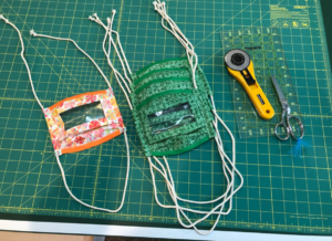
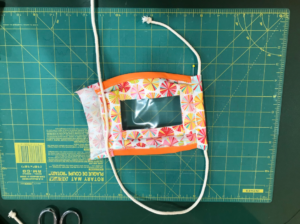
Photo of completed masks placed on a cutting mat along with fabric cutter and scissors

The “Clear Covid Mask” is a DIY COVID-19 mask that lets others see the wearer’s mouth. This helps everyone communicate better, especially those who are Deaf or Hard of Hearing.

David saw a TV news clip about Michigan nurse Sarah Bloomfield and her doubly heroic front-line design thinking. Designing a mask that helped a Deaf colleague work better with Sarah was clearly another case of how when we design for the extremes, everyone benefits. Our team decided we want to help make it easier for everyone to be able to make their own. So we worked with Sarah to create improved, accessible DIY instructions, prototypes, and plans. And indeed, field testing has demonstrated that, while people who are Deaf and hard of hearing benefit especially from others wearing such masks, everyone communicates better when they can see each other’s mouths.

Here’s the recipe that resulted…

What you will need

  • 100% tight-woven cotton fabric, 24″ x 8″ (0.6m x 0.2m) (cotton t-shirts, tea towels, or sheets can be used in place of new fabric)
  • Thin gauge clear vinyl or a heavy-weight clear shower curtain liner, 5″ x 3″/12.7cm x 7.62cm
  • Thread (polyester recommended)
  • ⅛” (3mm) thick cotton cording, 53″ (1.33m) long (cotton clothesline)
  • Extra-wide double-fold bias tape, ½” (12mm) wide

Pre-Assembly directions

Cut the materials to yield these pieces:

  1. Clear Vinyl Mouthpiece: 1 piece 5″ x 3″ (12.7cm x 7.6cm). Note: finished window is 4″ x 2″ (10.2cm x 5.0cm)
  2. Top Piece: 2 pieces 5″ x 2¼” (12.7cm x 5.7cm)
  3. Bottom Piece: 2 pieces 5″ x 4½” (12.7cm x 11.4cm)
  4. Side Pieces: 4 pieces 2″ x 7½” (5.0cm x 19.0cm)
  5. Side Casings: 2 pieces 2″x 6″ (5.0cm x 15.2cm)
  6. Cording: 53 inches (1.3m)
  7. Bias Tape: 2 pieces 7″ (18cm) each

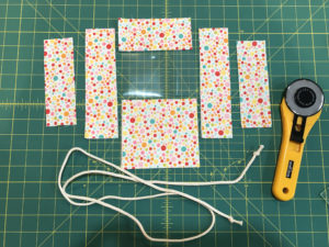
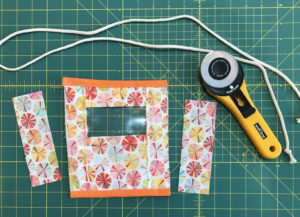
Note: All the components (with the exception of the side casings) will be made up of 2 plies of fabric, with good sides facing out. Here’s a photo that shows an example of one of each piece:

Photo of all the different components (fabric pieces, vinyl, cord) and cutter placed on a cutting mat.

Assembly Directions

  1. Seam Allowances:
    • All seams that are sewn through the vinyl are ½” (12.7mm).
      Note: You want to limit the number of times that the vinyl is punctured so that it doesn’t tear in the wash. Do not backstitch through the vinyl. Use knot mode or tie off seams starting and ending in the vinyl.
    • Seams that are sewn through fabric on fabric are ⅜” (9.5mm).
  2. Stitch Length:
    Set the stitch length to 3.0 through vinyl. Set it to 2.6 through fabric.
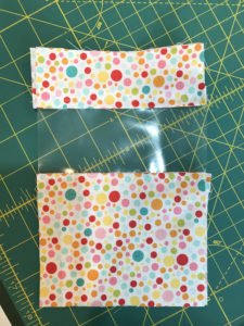
  3. Take the top pieces and place the good sides together (facing each other) then insert the clear vinyl piece between them, lining up the long edges of the fabric with the long edges of the vinyl. Stitch the long edge. Finger press open, then top stitch ⅛” (3.175mm) from the edge of the vinyl. Note: You might be tempted to grab your iron and press this open. Don’t! You don’t want to nick or melt the vinyl with your iron!

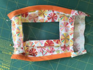
    Photo showing the top piece, the bottom piece and vinyl attached.

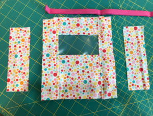
  4. Repeat with the bottom pieces, then the side pieces.

    Photo showing the top piece, the bottom piece, vinyl and the side pieces attached.

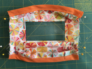
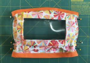
  5. Sew the double-fold bias tape to the top and bottom edges of the mask. Stitch ⅛” (3.175mm) on the other two raw sides as a stay stitch. Note: You can do all of this without taking it out of the machine by attaching the top piece of bias tape, turning and stitching down the side, attaching the bottom piece of bias tape, turning, and then stitching back up the other side. Make 3 pleats on the front of the mask as shown in the picture (the finished length of the sides must be 5″ (1.27cm) after you make your pleats), and pin in place. Depending on your comfort level with sewing, you can then baste this … or just keep it pinned for the next step.

    Photo showing the top piece, the bottom piece, vinyl, side pieces and the double-fold bias tape to the top and bottom edges of the mask.

    Photo showing the back of the 3 pleats pinned on the mask.

    Photo showing the 3 pleats pinned on the front of the mask.

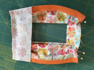
  6. Attach side casing pieces by placing the mask front side down (the side with pins in it, that you hopefully pinned, poking out on the sides so that you can still see them), and put the side casing piece good side down. It should extend ½” (12.7mm) above and below the edges of your side. Fold these edges under and sew, making sure to backstitch.

    Photo showing the side casing attached to the mask with front-side down.

    Photo showing the front view of the side casing attached to the mask.

  7. Tie a knot in both ends of the cording piece.
  8. After both side casings are attached, flip the good side up and pull casings out to the sides. Fold the raw edge under about ¼” (6.35mm), fold over the cording, and pin in place. Note: the knotted end of the cording needs to extend above the top of the mask. The loop should be at the bottom of the mask. This is very important as it determines where the window is when it’s put on. Stitch casing in place, close to the folded edge, making sure not to stitch the cording. The cording needs to be free to slide up and down for fit.

    Photo demonstrating how the cord is attached to the side casing of the mask before it is stitched.

  9. Done. Thank you!
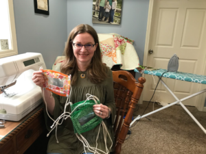
Photo of a proud person seated at a sewing machine, holding several finished masks in their hands.
Sarah Bloomfield with finished masks!

Descriptive transcript of “Five reasons why we should care about accessibility”

This is a transcript of the video Five reasons why we should care about accessibility

(TEXT ON SCREEN: Five reasons why we should care about accessibility – Lesson excerpt from eAccessibility with David Berman)
(David Berman appears on screen and faces the camera for the duration of this video. David is wearing a dark grey suit with a black shirt and tie. Also on the screen are slides he is speaking to: David audio describes all relevant slide content as he goes.)

What I want to bring you to is five reasons why we need to care about accessibility. And the first one is, there’s just so many of us on the planet today. I’m showing a picture of Times Square, New Year’s Eve. There’s perhaps over a hundred thousand people packed in there.

And I’m going to start a poll. I’m going to show you how the polls work. So I’m going to launch a poll. And I’m going to ask you the question– and I’m asking it now out loud as well as in writing. What proportion of people do you figure regularly experience a substantial disability? And the way the poll works is I launch the poll. And those of you that can see the screen c see that there’s five choices– 6%, 9%, 15%, 18%, or 100%. I’m asking you to tell me what proportion of people you think regularly experience a substantial disability. And you can use the poll tool. Or you can use your voice to announce your result, and we’ll log it in as well for you.

I’m just going to leave that poll in as I’m watching over 70% of us have voted already. All right, it looks like almost everyone has now voted. We’re over 80%. I’ll just leave it open a few more moments. And I’m going to close the poll now.

And here’s our results. So what do we got? Well, so the majority of us chose the fourth of the five answers, 18%. So the majority of us are thinking 18% of people live with a substantial disability. And you’re kind of right.

I think it’s 100%. We’ll see why that is soon enough. But whether it’s 18% or it’s 100%, I think we get it.

And so if we look at the 18%– and how many people are living on the planet these days? I’m going it’s say 7 billion people, of which 18%– so it’s 18%, 7 billion. That’s about a fifth. That’s about 1.2 billion people who aren’t buying our products or aren’t getting our message about health care or whatever reason. That’s a lot of people to leave out. And of course, if we’re into publishing on the web, we want to reach everyone.

Now, the second reason to care about accessibility is search. Statistics show us that, at least in Canada and the United States, over 70% of retail purchases begin with an online search. And Google search engine, the AI engine is getting smarter and smarter, but still, perhaps, has the cognitive ability of perhaps a four-year-old. And because of that, if we follow accessibility principles to structure our information away that Google’s confident that it understands the relative importance of information, and it’s confident that you’re presenting information that is credible, then it increases the chance that your results are the ones that are going to be presented, and that your results are going to be presented at the right time to the right people. And everyone wants that. For many organizations we work with, search alone was worth the investment in creating an accessible product.

The third reason– and I’m showing a picture right now of Stephen Hawking as an example of the importance, from a human resources perspective, that if we want to attract and retain the very best people, there’s not an HR department on the planet that wants to eliminate 18% of the potential people to help make their organization succeed right off the bat because you can’t work there. And indeed, part of our process with creating accessible products isn’t just to make sure that the output, the end product is accessible, we actually want to create products in a way that everyone can be involved in every step of the process of creating the product, whether it’s the content management system authoring in a website, or if we’re creating a document that, even while the document is still in Word or PowerPoint, we want an accessible experience and not just wait for the final publishing of the website or the publishing of, let’s say, a result in PDF or an EPUB file.

The fourth reason is the social justice reason. It’s just the love– I’m showing a picture of someone who looks shockingly like me hugging a tiger. And well, it’s just the right thing to do. Here in Canada, we may not be the most glamorous country on the planet. But a lot of people do give us kudos for often demonstrating how we can create a civilization that doesn’t leave folk behind.

But the fifth reason, the fifth reason is the regulatory reason. And whether it’s federal regulations, or provincial or state regulations, or– we’re all federations here. Hey, Canada, US, it’s true. We’re all federations. All right. So we can talk federal. OK, so at the federal level, a lot of you, I know, are here because you’re it’s being demanded of you that in order to comply to meet or exceed what the government is now demanding that you need to know how to do these things.

(TEXT ON SCREEN: David Berman Communications)

Transcript of “Web Accessibility Matters: Why Should We Care”

This is a transcript of the video Web Accessibility Matters: Why Should We Care.

 
(Image of a computer keyboard with a wheelchair symbol on one of the keys. David Berman appears on screen and faces the camera for the duration of this video. David is wearing a dark grey suit with a black shirt and tie. David is also wearing goggles, which he will explain during the video.)

Hi, I’m David Berman and I’m eager to share with you why accessibility matters.

You’ve picked the perfect time to learn about why online accessibility matters so much. And this is the first of a series of segments where we’re going to learn about the type a difficulties people are up against in the amazing assistive technologies that we’ve invented to overcome those difficulties.

We’re going to talk about how we can create online presences with no trade-offs at all and what’s the best way to organize ourselves to get it done.

But first, I’d like to tell you about these glasses I’m wearing. These glasses are part of a kit that’s designed by a friend of mine, George Zimmerman. He’s a doctor in Pittsburgh, Pennsylvania.

To think about disabilities we tend to think about extreme disability someone has been blind since birth. Someone who can’t hear at all. But in fact the vast majority of disabilities actually are more subtle and perhaps more temporary.

Now on my left eye I’m wearing a lens which limits my vision to about 3 degrees. On my right eye more of a… this is a 20/200 lens that kind of gives me a Trailer Park Boys Coke bottle glasses kind of experience of the world. With this kit George’s made it possible for people with more typical sight to simulate all sorts of challenges.

Here’s my tiger; she’s wearing for instance a lens on her left eye that simulates cataracts and on the right eye she’s also limiting her eyesight to more of a 10 degree view. You’ll see more of her later.

Now before we get into this though, I’d like to examine why we should care about accessibility. Surely we all think of course, you know we want to have a loving society where we don’t leave anyone behind. But in fact I see five clear reasons why there’s never been a better time for us to care about online accessibility.

The first reason is that there’s simply so many of us. On our planet today there’s perhaps seven billion people. And people make various estimates of how many people have disabilities: substantial disabilities. Some say 15 percent… 20 percent …25 percent. Even with the lowest of those numbers, with seven billion people, we’re looking at leaving perhaps a billion people out.

Now you and I are both on the Internet right now. But yet for seventy percent of humanity today the Internet remains a rumour as Nicholas Negroponte reminds us. But this is the decade where that all changes. By the end of this decade the majority of humanity will be online. We’ll all be online together. And we have the opportunity then to liberate millions upon millions of people. If we can create an Internet where we leave no one behind.

The second opportunity is…regards search engines. Because although we’re talking about billions of human beings in fact the most frequent visitors to most of our public facing websites aren’t human at all. They’re machines such as search engine robots. And whether its Google or Yahoo or Bing, the Google search engine robot has severe disabilities. It can’t see, it can’t hear. It’s got the cognitive abilities perhaps of a four-and-a-half year old and yet the majority of online searches where people are looking to buy a product begin with the search. So if we want great SEO if we want high search rankings, that also starts with creating accessible web presences.

The third reason is about human resources. It’s about our colleagues. It’s about making sure that even in our workplaces no one gets left behind. If we want to attract and retain the best people available we don’t want to lose out on perhaps 25 percent or more of the potential people that could be working in our organization. We want everyone to be able to collaborate in way that’s effective. And so we want our presence to be accessible as well.

The fourth reason: the social responsibility argument. Certainly…especially as Canadians we’re known for demonstrating how one can create a civilization where we measure our success by how we treat those who either are permanently or temporarily our weakest. And certainly then there’s a lot of the love in making sure that we leave no one behind.

But the fifth reason and perhaps this is the reason that compels us to be dwelling on this today is a regulatory reason. More and more jurisdictions around the world are passing laws and regulations saying you must make sure your website maintains a minimum level of standards about web accessibility document accessibility, PDF accessibility. Whether you’re in a region where laws have been passed, where litigation is becoming more popular, it’s good business sense to keep ahead of web accessibility.

Now here in Ontario, I’m proud to say we live in a country where at a federal level there’s a history of leadership. Our federal government has been a leader in web accessibility since the 1990s And a court decision in 2010 compelled us to up our game. And right here in Ontario, Ontario is the first place in the world where not just government but any organization — private sector, nonprofits, anyone with at least fifty employees is required by law to have a public-facing web presence which exceeds a certain minimum level of accessibility. A very well defined level.

And it’s an exciting time to be alive. And in fact if you’re if you’re here in Ontario, were finding that the tools and the techniques that are being developed here are being used around the world.

I had the privilege of working with the World Wide Web Foundation this past year on this year’s Web index.
I’m not sure if you ever check it out: webindex.org. This is an annual benchmark program, where we compare how different countries are doing in terms of various aspects of making the web a better place. And one aspect of this is web accessibility. And my job was to audit dozens of countries’ results as to how they were doing in terms of their banks, their telecommunications companies, their governments at how they’re doing with web accessibility.

I’m very proud to see that Canada year-over-year always is in the top five of dozens of countries.
But I even found legislation that was pointing back to actually naming Canadian standards as the one to follow.
So we have found the perfect time: we live in a time when we can take the skills and the techniques and this movement in our society to embrace web accessibility.

I find is similar to how ten years ago, if I suggested to you there would be a recycle bin in every room in a government office you’d say it’s crazy. Yet in 10 years time we’ve seen this whole shift towards green.

Well this is the decade we shift towards accessibility. This is the decade we do better business… we do better civilization…by all learning how to create a more accessible web.

>>NARRATOR: Appointed a high-level advisor to the UN, David Berman has traveled to over 50 countries, inspiring professionals on how we can design a better civilization. Rated number one in North America as a speaker on accessibility he’s presented at the largest design conferences on four continents. David has audited websites of 40 countries for the World Wide Web Foundation. His book “Do Good Design” is published in five languages. Expert speaker David Berman
Links to resources mentioned can be found at: www.davidberman.com/accessibility#resources

(Text on screen: Produced by David Berman Communications
Ben Armitage; Jennifer Beharry; Veronica Feihl; Simone Flanaghan, Cynthia Hoffos; Steven Kimball; Maciek Kozlowski; Khadija Safri; Justin Stratton.
Copyright 2014 David Berman Communications.
Sources and intellectual property rights available upon request.)

(music extro)

Transcript of “Web Accessibility Matters: Now is the Perfect Time”

This is a transcript of the video Web Accessibility Matters: Now is the Perfect Time.

 
(Image of a computer keyboard with a wheelchair symbol on one of the keys. David Berman appears on screen and faces the camera for the duration of this video. David is wearing a dark grey suit with a black shirt and tie.)

So here we are living in the decade where online accessibility will become ubiquitous. And I think it’s amazing that after ten thousand generations of humanity we get to live in this decade. But the history of creating technology that helps people overcome disability and challenges actually goes back over a hundred years.

Alexander Graham Bell in 1876 was not trying to invent the phone that we all know him for; he actually was trying to create technologies that would help teachers in a school for the deaf in Massachusetts simply be able to do a better job. And in doing so he ends up inventing the microphone, the amplifier, the transducer, the loudspeaker all things that we take for granted and we find in so much technology today were all invented to overcome an extreme disability.

Now Alexander goes on to create Bell Labs and of course Bell’s still around today, but in New Jersey, Bell Labs in the 1930’s was continuing to work on helping people deal with challenges having to do with hearing and they had develop hearing aids which were an absolute wonder. But in in the thirties, a hearing aid was a big thing that you wore around your neck, it was heavy; the signal to noise ratio was not so great; used up a lot of power; it was very obvious you were walking around with kind of a small billboard on saying I have a challenge. And, so they were working on how to make a better hearing aid. In fact after the 1940’s, physicist at Bell Labs mashed up quantum physics and they invented something called the transistor. Now the transistor was invented as something to create a better hearing aid. They need a hearing aid that would be small; that would have a great signal to noise ratio; would take very little power. And so, they make their hearing aid in they create the
transistor and they figure they were done.

Except that then in post-war Tokyo this guy Mr. Morita decides to buy the worldwide rights for the transistor. He figures hey if people who can’t hear are enjoying the idea of being able to walk around with a device that can make it easier to hear, wouldn’t everyone like that? He comes up with the idea of a radio that you can carry anywhere. He invents the transistor radio. He invents a company we now know as Sony.

And although his family may have thought he was crazy to spend his life savings for the rights for this transistor of course the transistor goes on to become ubiquitous in all our technologies.

In the current version of Alexander Graham Bell’s phone which none of us… I’ll drive back home if I realize I’ve forgotten my phone and there’s millions of transistors in here. There’s transistors in all these devices we love so much: our tablets, …and our laptops, … and well transistors got us to the moon and back. And yet it all starts off with designing for extremes. And the key here is that when we design for the extremes everybody benefits. Considered these traffic signals I’m showing — typical traffic signals. These are some photos I took in Seoul Korea, but they could be they could be downtown Toronto at night.

(Two almost identical images, side by side of Korean streetscape and traffic lights at night. The image on the left displays green traffic lights, and the image on the right displays red.)

The key is that we have the standard signals for red for stop green for go and yet if I press my magic button I’ve simply removed all the colour for those lamps. And now you’re seeing the experience of someone who has a complete colour deficit. Now that’s what it looks like at night to approach a traffic signal. Slightly over 10 percent of men in Canada have some level of colour deficit; and the largest source of accidental death in our country is due to traffic accidents. And this is true all over the world. So it’s seems a little crazy to me that we have this system that relies solely on colour.

Now we have a made-in-Canada solution for this. In Quebec most of Quebec uses traffic signals that don’t rely solely on colour. There’s three cues: there’s the classic colour system green for go, red for stop, but also the lamps for stop are squarish where as the go are roundish and the caution is diamond-shaped; and as well there’s two lamps for stop and one for the others. So we have three cues. We’re using colour for the legacy users but we’re also using the number of lamps as well as the shape of lamps. And by giving people various ways of knowing information we don’t have to rely on just one sense, which is brilliant. And everyone prefers these lamps. As you come closer to the intersection just the parallax effect of the twin lamps being further apart as you come forward allows you to know how far away the intersection is at night.

We tend to think often of design as simply a matter of better decoration but in fact design can be life and death. The great thing is that we live right now in a time where it’s never been easier to make everything accessible for everyone. The technologies have never been less expensive the innovations are coming more and more quickly. And so I don’t want you to worry at all if you don’t know that much about web accessibility. Because frankly this is the perfect time to get involved. Even in the past ten years the amount of effort it takes to make a website let’s say or PDF file accessible is a fraction of what it was back then. So this is the perfect time to learn how to get this done.
(music comes up)

>>NARRATOR: Appointed a high-level advisor to the UN, David Berman has traveled to over 50 countries, inspiring professionals on how we can design a better civilization. Rated number one in North America as a speaker on accessibility he’s presented at the largest design conferences on four continents. David has audited websites of 40 countries for the World Wide Web Foundation. His book “Do Good Design” is published in five languages. Links to resources mentioned can be found at: www.davidberman.com/accessibility#resources

(Text on screen: Produced by David Berman Communications
Ben Armitage; Jennifer Beharry; Veronica Feihl; Simone Flanaghan, Cynthia Hoffos; Steven Kimball; Maciek Kozlowski; Khadija Safri; Justin Stratton.
Copyright 2014 David Berman Communications.
Sources and intellectual property rights available upon request.)

(music extro)

Transcript of “Web Accessibility Matters: Difficulties and Technologies: Avoiding Tradeoffs”

This is a transcript of the video Web Accessibility Matters: Difficulties and Technologies: Avoiding Tradeoffs.

 
(Image of a computer keyboard with a wheelchair symbol on one of the keys. David Berman appears on screen and faces the camera for the duration of this video. David is wearing a dark grey suit with a black shirt and tie.)

The best way to get the best results from from web accessibility is to understand the type difficulties and the kind of technologies we use to mitigate those challenges. And so my plan now is we’re going to walk through the type of difficulties people encounter.

I’ve found that we can create an accessible website without trade-offs. You see often people think if I make my website accessible I’m going to have to make the experience worse for my typical users. And that could be true if you don’t understand why or how we’re doing this. But if you truly understand the difficulties and the type of technologies were using to overcome them, then it’s possible to create an accessible site, accessible product that has no trade-offs at all.

In fact chances are we’re going to make things better for everyone because when we design for the extremes everyone benefits. When we think of the type of challenges people are dealing with I find it useful to consider disabilities in categories.

The first one being permanent disabilities. We tend to think about the permanent disabilities first. Someone who’s blind since birth and may never see at all in their lifetime. Or someone who can’t hear at all and may never hear. But in fact the vast majority of difficulties and challenges are more subtle and temporary.

Temporary disabilities include everything from maybe you’ve just been to the eye doctor and there’s drops in your eyes, or maybe you’ve got the flu, or maybe you’re pregnant, or maybe you’re drunk. These are all things the come and go.

You may have a post-traumatic stress disorder where at times of day you don’t have your typical cognitive faculties. And we need to consider the whole breadth of disability when we’re designing the truly accessible product.

We also have acquired disability as we age our eye sight tends to go. We tend to have more mobility challenges as we get older as well, you know.

The typical life expectancy of a man in the Middle Ages in Europe was perhaps 36 years old. And yet all of us plan to live much longer than that. And so there’s acquired challenges that are important as well.

And then finally we have societal challenges as well. We have things that shouldn’t be a disability at all perhaps like being left-handed. This also can be a challenge in some parts of the world.

Now when we think of the different types of impairments people are challenged with, it’s useful to simply think about the different human senses. And I’m going to march through the human senses and look at the challenges in each area in the order that they tend to be the biggest challenge for us on the web.

The most common type of difficulty we tend to dwell on is the visual challenge: people having problems seeing. And it makes sense because for most of us the largest bandwidth pipe for information coming into the human brain is the eye. And whether someone has an extreme situation where they can’t see at all or perhaps they see fine but they don’t see certain frequencies of light so certain colours are left out for them. Perhaps they have a constraint on their vision.

We have a whole host of assistive technologies — which I’ll get into more deeply later — which helps balance off this challenge of not being able to see.

The second group of challenges most prevalent when we’re designing products online are dexterity or mobility challenges. And again this can be of a range from the extreme of perhaps someone is a quadriplegic who has no use of their limbs from the neck down. Or could be as subtle as someone who has complete use of all of their limbs but it hurts to move in certain ways and so they prefer not to.

And so from those two extremes we have a continuum of mobility challenges and we have a great range of assistive technologies that help us mitigate for mobility challenges.

The third group of assistive technologies range around hearing difficulties and again there’s a range. Some people just got a little too close to the left speaker at a Genesis concert younger in life and don’t hear so well in one ear than the other. Others maybe don’t hear at all. Some people can’t hear certain frequencies and in fact we find in the acquired category as we get older there are certain frequencies which simply drop off completely. Again we have technologies which overcome this.

Now your web product, your website may have a lot of sound or may have not at all. But if you have audio content, we do have a variety of techniques to help overcome the challenge that some people either all the time or some other time can’t hear.

The fourth group are language and speech difficulties. And that’s quite a range of challenges here. It could be simply someone didn’t learn how to speak the language of your site early in life. And you know we humans were designed to acquire language at the age of three or four, so if someone acquired let’s say English or French later in life it’s never going to be as natural as if they learned it as an infant. As well some people are just wired differently.

For some people language comes in a different way. For some they experience language in a typical way but the way comes out, the way they express themselves is very different. And so we have quite a range of technologies which can also help mitigate for language and speech problems.

Kind of a sibling to this are cognitive and learning challenges. And there’s quite a range here as well: everything from an extreme dyslexia from simply subtle challenges of being able to remember certain facts.

One of the really big challenges we have with cognitive difficulties is that they can be quite subtle and not present apparently. For instance, if someone has a severe visual challenge they may arrive with a service dog or a white cane. It’ll be apparent to you fairly quickly that they don’t see or they don’t see that well. However with cognitive challenges usually there aren’t readily apparent, in fact the person who has the cognitive challenge may not even know themselves that they have them.

You know we do work at Carleton University and we find that the students we help with disabilities… over eighty percent of the kids we’re helping out are those with cognitive challenges.

So again we have a variety of technologies that can help overcome learning disabilities. In fact, I’m convinced we all have dyslexia to a certain degree and attention deficit disorder to a certain degree. And we do something to kids in our society, which is rather tricky, you know. Consider this. If you meet a tiger in the wild and …you know this is a tiger …and if I rotate it’s still a tiger …and this is a tiger …and this is a tiger. That’s the reality of living in the forest. And yet we teach our children an alphabet where if you take a letter a lower case ‘b’ and you rotate it, it becomes something completely different: a ‘d’. And then you flip it downward it becomes a lower case ‘p’ you flip it again it’s a lower-case ‘q’. This type of symbol — it’s brilliant — but you know we we’re running on fifty thousand year-old hardware and yet the idea of written language is only perhaps 6 or 7 thousand years old.

We all struggle then with symbols that change their meaning. Just those that struggle enough with it that it falls outside the norm we have a label for that. The last group have difficulties are ones we invent, as if we don’t have enough already in our society.

Some parts of the planet are still very harsh on people who try to write with their left hand as children rather than with their right. And we stigmatize some disabilities. We make it difficult to be honest with each other about the challenges we have. And it really depends. And we’re getting better and better at this.

You know, a lot of people I know wear glasses. And you don’t tend to think glasses as an assistive technology. But I’m sure the first time someone wandered out into the streets in seventeenth-century Europe with lenses strapped to their face, people must have pointed and said that guy’s crazy. And yet today we feel completely comfortable letting others know that we don’t see so well. And yet for other disabilities we’re not quite there. And this is part of the challenge.

As a society we’re quickly evolving to be more caring and more accepting of our differences and when we accept our differences and recognize them only then are we able to do the best job we can of communicating with everyone and leaving no one behind.

(music comes up)

>>NARRATOR: Appointed a high-level advisor to the UN, David Berman has traveled to over 50 countries, inspiring professionals on how we can design a better civilization. Rated number one in North America as a speaker on accessibility he’s presented at the largest design conferences on four continents. David has audited websites of 40 countries for the World Wide Web Foundation. His book “Do Good Design” is published in five languages. Links to resources mentioned can be found at: www.davidberman.com/accessibility#resources

(Text on screen: Produced by David Berman Communications
Ben Armitage; Jennifer Beharry; Veronica Feihl; Simone Flanaghan, Cynthia Hoffos; Steven Kimball; Maciek Kozlowski; Khadija Safri; Justin Stratton.
Copyright 2014 David Berman Communications.
Sources and intellectual property rights available upon request.)

(music extro)

Transcript of “Web Accessibility Matters: Assistive Technologies Drive Innovation”

This is a transcript of the video Web Accessibility Matters: Assisstive Technologies Drive Innovation.

 
(Image of a computer keyboard with a wheelchair symbol on one of the keys. David Berman appears on screen and faces the camera for the duration of this video. David is wearing a dark grey suit with a black shirt and tie.)

There’s been more people liberated in all the history of civilization by information technology in the last 35 years then all the wars and revolutions in human history.

And now I’d like to show you what some of those technologies are because we have such a panorama of human ingenuity going on that are bridging the challenges and making it possible for people with a variety of challenges or disabilities or even temporary impairments to be able to perceive and participate in ways that simply weren’t possible before.

Living in a digital age means that everything’s now digitized it means that things that — words ideas innovations — that couldn’t be perceived before can now be perceived by everyone.

Let’s look at what some of those technologies look like. When we talk about an assistive technology we’re talking about something that helps us has overcome a disability or impairment. Some assistive technologies are designed specifically to take care of a disability. For instance when we think let’s say if I had a wheelchair in front of me… a wheelchair is something you really wouldn’t use for anything but a mobility challenge.

On the other hand, there’s other technology, say something like Skype… lots of people use Skype for typing back and forth to overcome various disabilities, even though Skype was not designed as an assistive technology. Now when we talk about electronic assistive technologies we’re talking about assistive technologies that were specifically designed to overcome challenges in a digital world. And we can think of them generally in two categories: as hardware assists and software assists.

Let’s look at some of the ones that are most prevalent, keeping in mind that in general when we identify an assistive technology typically we’re either substituting one human sense for another for a sense that isn’t that isn’t available to us right then or we’re taking a sense and magnifying it. So for instance let’s say someone can’t read. And maybe they can’t read because they don’t know how to read or maybe they can’t read because they can see the letters. Either way we can use the ear instead of the eye. And so we have technologies that read things out loud. A screen reader then is often the most common example of an assistive technology that’s accommodated through good web design. And so a screen reader will simply read the content out loud, if the website, if the product, if the PDF, if the document is designed to be read out loud.
And so one of the key things we do with websites is make sure that they work well with screen readers.

We have a number of other technologies though that can help us as well: for instance we have software that’s actually designed to optionally read out loud. If someone can read, but they can’t read little things, we have technology that magnifies: makes things a larger. And one of the great things about Windows 8 over windows 7 or Mac OS is that they’re screen magnifiers built right into the technology, so that the operating system helps you enlarge things so you can see them better.

Instead of reading we can use the sense of touch and so we’ve all heard of braille, and so here’s a case where someone can’t see, but they can still read by being able to feel the letters. But that technology has manifested itself in the online world through using innovation in Braille. So for instance if you have an iPhone, this clever guy in the United States, designed this thing called Speed Dots and what it is a screen protector that goes right here on your iPhone and lets you feel where the keyboard is, as well as protecting the phone at the same time.

We have much more sophisticated technology as well though for instance refreshable Braille display is a technology that has a series of dots which pop up to be just like Braille and they just keep popping up and showing different information depending on what’s going on right now. And in this case this is integrated into this entire device, which is a smart phone for people who can’t see. So of course it’s got no visual display, but has all the other attributes: a camera and braille line display.

Now if you can’t type and maybe you can type because you don’t know how to touch type. Or maybe you can’t type because your hands shake or or perhaps you don’t have use of your fingers at all, hence we have technologies that allow you to speak.

Now here’s another case where design for the extremes is benefiting everyone. Because of course in the last few years the ability to direct our smart phones — and who knows if sometimes soon perhaps our automobiles — through voice has become something that we’re all enjoying. But the technologies behind Siri and Google Now started two decades ago as technologies being developed specifically for people with extreme difficulties.

Now if you can’t type as well, you could perhaps use different parts of your body to be able to simulate typing. I’m showing a picture for child and she’s wearing a SIP puff device. This is a device that let’s say you’re quadriplegic you have no use of your limbs below your neck, but wearing this headset she can sip and puff on a straw and that’s just like left clicking or right clicking a mouse. And by moving her head around that’s like moving the mouse around. So using this device, she can navigate any website in the world. Well, not any website, she can navigate websites that have been designed according to the standards that are becoming ubiquitous. And these are the very standards that are link to the legislation that we’ll be speaking about later.

The key is if you create your website to be accessible, then your website is going to work with all of these technologies; as well as technologies and haven’t even been invented yet. See the key to future-proofing your website, the way of inoculating it against future innovation is to follow the standards. Anyone designing new technologies today new assistive technologies is designing them in such a way that they’re going to comply with the same standards. So we can’t anticipate what’s coming next but we know that if we follow these standards, our sites will already be compliant with browsers and technologies that haven’t even yet been invented.

Here’s another example: something coming down the pipes hard. Instead of using a mouse you can just look and blink. This is a technology called the Nouse — nose and mouth — because what it does is the camera in the laptop tracks where your nose is and by tracking where your nose is it knows where your eyes are. So the idea is you just look at what you want and then you blink. And it can tell the difference between a clearing-my-eyelids blink and a let’s-launch-the-missile blink so the nouse — this type of technology is becoming is becoming so attractive that Lenovo is planning on building mouse-like technology into all their laptops over the next couple of years. Imagine people walking around with their with their with their tablets blinking and stuff. It’s coming coming to a tablet near you.

Now when you combine that with the ability to have an on-screen keyboard it means that you can potentially choose letters as well. So it means someone can type just by looking and blinking. That opens up all sorts of possibilities for people with extreme situations as well as anyone who would enjoy the efficiency of that.

Another swap is if you don’t have the ability to hear at a certain time or the ability to speak, we have alternatives using gestures of using typing, of being able to watch someone as they do sign language. There’s so many different techniques we’ve come up with to overcome (difficulties) and the new ideas are just propagating — as more and more people are able to develop — for tablets and all sorts of new touch-based technologies. This is all about paddling towards an ideal situation.

Our goal is simply to paddle towards a common ideal. That ideal is that no matter what your disability, no matter what you difficulty, no matter your skill level, no matter what browser you’re using, what operating system you’re using, what type of technology you’re using, what speed your Internet connection is; no matter what, that you should be able to access everything all the time. And you know what, we’re never going to achieve that. And I don’t want you to be intimidated by that. Because we don’t have to do a perfect job. We simply have to do a better job than we’re doing today. And if we simply exceed these minimum standards that have been established for us, we can include everyone. We can not just accommodate everyone, we can have the ability to delight everyone. And that’s worth doing.

(music comes up)

>>NARRATOR: Appointed a high-level advisor to the UN, David Berman has traveled to over 50 countries, inspiring professionals on how we can design a better civilization. Rated number one in North America as a speaker on accessibility he’s presented at the largest design conferences on four continents. David has audited websites of 40 countries for the World Wide Web Foundation. His book “Do Good Design” is published in five languages. Links to resources mentioned can be found at: www.davidberman.com/accessibility#resources

(Text on screen: Produced by David Berman Communications
Ben Armitage; Jennifer Beharry; Veronica Feihl; Simone Flanaghan, Cynthia Hoffos; Steven Kimball; Maciek Kozlowski; Khadija Safri; Justin Stratton.
Copyright 2014 David Berman Communications.
Sources and intellectual property rights available upon request.)

(music extro)